
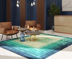
Interface, Inc., a global player in flooring and a pioneer in sustainable development, launches its new collection: Woven Gradience. This new range combines stimulating colours, inspired by nature, with muted and subtle gray tones to create floors with unique patterns.
Woven Gradiance: a soothing and stimulating collection
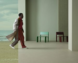
Woven Gradience has bold hues that fade into soft, relaxing grays, allowing designers to easily incorporate flashes of color into flooring designs. The collection is a perfect option for the tertiary, hospital or education sector.
For Mandy Leeming, design director at Interface: “To create Woven Gradience, the team was inspired by the mixture of different colors and textures found in nature. This ode to color naturally finds its place in work environments. By introducing bright, bold and natural tones, we can craft visually stimulating flooring designs that are contemporary and fresh in spirit. Greys, on the other hand, can also be combined to create renderings with muted tones. The different colors can blend into each other to create separate, bespoke pathways or areas. This collection offers a smart and functional approach to working environments, without ever sacrificing quality, design or even durability. »

The Woven Gradience collection is part of Interface's Carbon Neutral FloorsTM program, making all of its tiles carbon neutral throughout their life cycle. The tiles incorporate the CQuestTMBio underlay, PVC and bitumen free, made with a bio-composite based on bio-sourced and recycled materials, which have a net negative carbon balance.
The collection includes 12 colours, all inspired by the colors of nature, which can be positioned in a multitude of ways to create unique flooring designs. The eight bold shades in the selection (Emerald, Ocean, Terracotta, Sunrise, Rose, Forest, Lagoon and Sage) sit alongside grays spanning the entire spectrum from Ink to Charcoal, Stone and Pearl. Each bold colorway can be mixed with a gray or other tone to create a vibrant color palette.
Selection of products


To read also


Popular News
-
 Is the investment in stone going against the wall?
-
 The mortgage rate fell in February, for the first time in 1 years
-
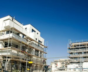 Building and real estate: a sector plagued by crises but whose ecological transition is underway
-
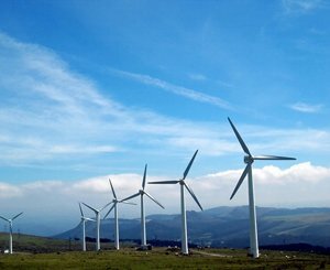 As the world burns more fossil fuels than ever, persistent obstacles hamper the race for renewable energy